
Web Summit Vancouver Day 1: Creative Data, Disposable Software, and the Scale of What’s Coming

I knew Web Summit Vancouver was going to be big. I was not fully prepared for how big. On their website they claim to run "the world's largest technology events, connecting people and ideas that change the world". At 20,000+ attendees, it’s the largest conference I’ve attended since the pre-pandemic Tableau Conference in Las Vegas.
Interestingly, unlike my experience in Vegas, it did not feel packed except for at the Masterclass sessions that I attended. Maybe the Vancouver Convention Centre is good at flowing this number of people, or perhaps a lot got out to enjoy the sun. Today it’s rainy and windy, so things may change.
The sheer size changes how you approach the event. With 14 different content tracks plus talks and masterclasses, you can’t simply wander and expect to stumble into everything you want to see. You need a plan.
I quickly realized the best strategy was:
- identify priority sessions
- keep 2–3 backup options at any given time
- constantly check room capacity and timing
- accept that you will inevitably miss something interesting
The conference app helped a lot, especially with the integrated maps, but it also highlighted how much room there still is for improvement in large-event navigation.
At one point, my schedule had five or six overlapping or near-overlapping sessions that I wanted to attend. This is perhaps not how anyone’s conference schedule should look.
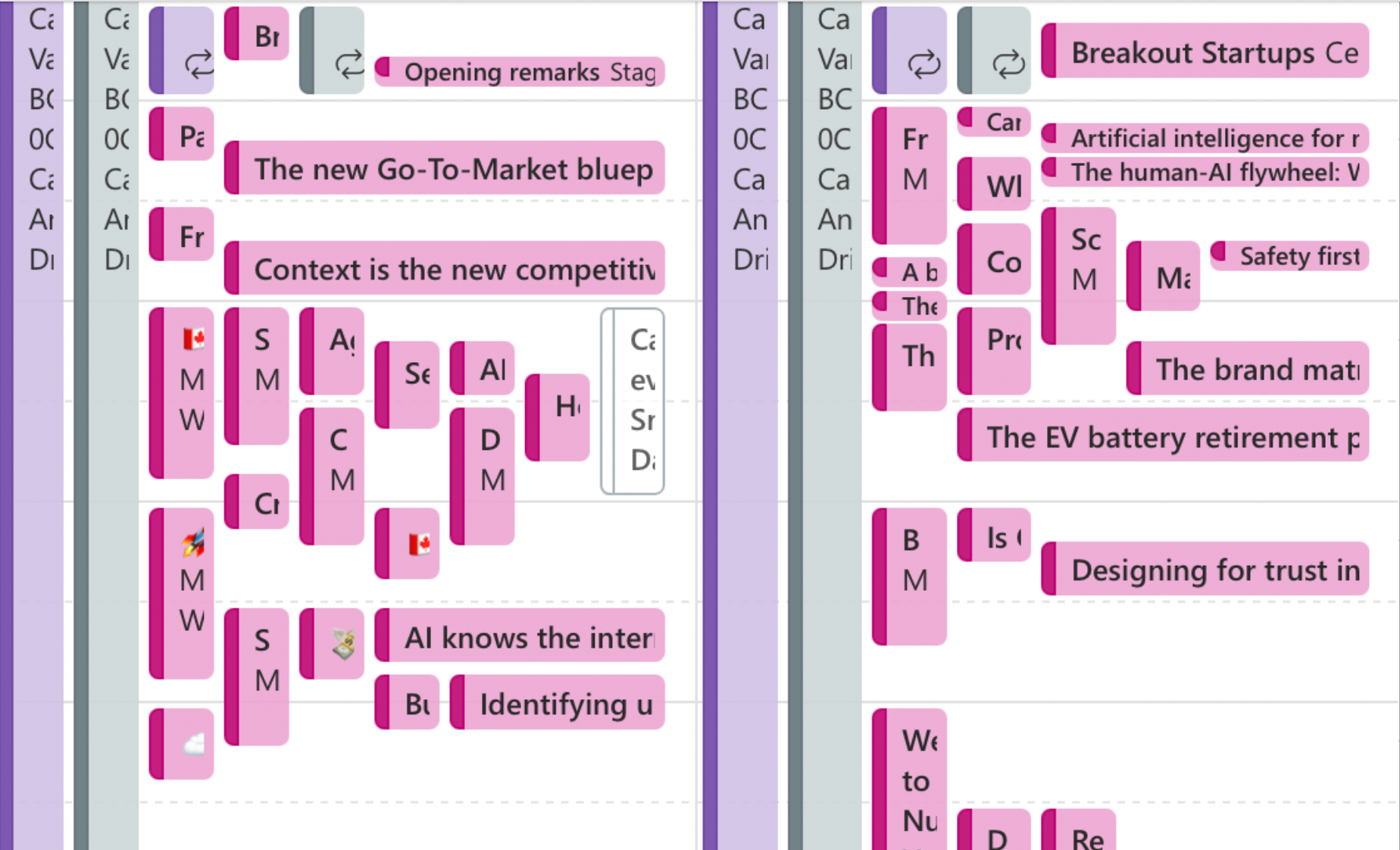
But it also reinforced why travel-time awareness matters so much for session scheduling and planning for events with this size of venue and number of attendees.
While most of the sessions were within the same convention centre, the travel time between sessions can make or break your chances of being able to attend a session you wanted.
Interestingly, it reminded me of university course scheduling policies. Many institutions intentionally avoid things like 10-minute overlaps between classes because they know students and faculty physically need time to move between spaces.
Web Summit, by contrast, ends up creating many of these issues because sessions vary in length and location. You find yourself calculating whether it’s worth leaving one session early to have any hope of getting into the next one.
Better indoor maps could improve this. Web Summit had good integrated maps that helped you find a specific point / session / booth, but zooming into a specific item of interest meant you lost the context of the full space, and there was no capability to navigate from where you were now to where you wanted to be. I found myself searching big landmarks near me and then the place I wanted to be, and mentally drawing my own map.
Anyone who has attended a conference of this size knows that “next session starts in 5 minutes” means very different things depending on whether the room is upstairs, across the convention centre, or on the opposite side of a crowd bottleneck.
I’ve seen some brilliant work using FME and indoor mapping technologies for wayfinding over the years, and I keep hoping to see that sophistication appear on the conference circuit. The data clearly exists, now someone just needs to connect the pieces.
Struggling to visualize course scheduling, space utilization, or develop capacity planning reporting?
Disposable Software and a Full Circle Moment
One of my favourite sessions of the day came from my former SIAT/ItaliaDesign classmate Jayme Cochrane, who is now leading a new Bachelor of Creative Industries program at the British Columbia Institute of Technology.
His talk focused on the idea of “disposable software.”
The premise is simple but important: the time required to build software has collapsed. But also that we might miss something from the era of software needing to be reliable without fail.
With AI-assisted development tools, low-code platforms, and rapidly evolving frameworks, it’s now possible to create highly customized software for incredibly specific use cases in a fraction of the time it once required. Here's an example of a feedback bot he built for students.
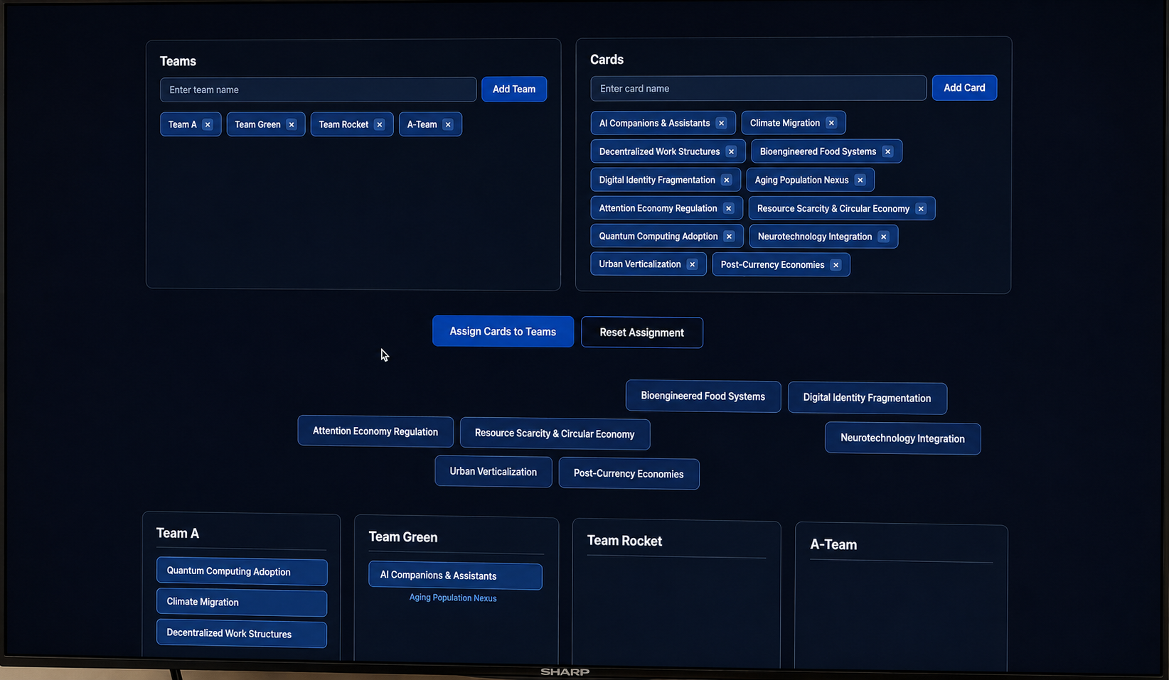
But Jayme’s key point was that just because we can build something doesn’t necessarily mean we should.
Some tools only need to exist briefly. Some workflows only solve a temporary problem. Some applications are valuable precisely because they are lightweight, experimental, and disposable.
That framing resonated with me because I think many organizations, including universities, are still operating with assumptions from an era where every software decision implied years of implementation, governance, and permanence.
That reality is changing quickly.
At the same time, the session was a personal full-circle moment. It was genuinely nice reconnecting with classmates from my SIAT days and seeing the different ways people are now shaping industries, programs, and ideas across technology and design.
Making Data Human
Another standout session came from Jason Carmel of WPP: Making the Case for Creative Data.
The presentation traced the evolution from the “big data” era of the 2000s into today’s AI-driven environment, but what stood out most was the focus on making data feel human. Up until recent history, data people often served in the middle:
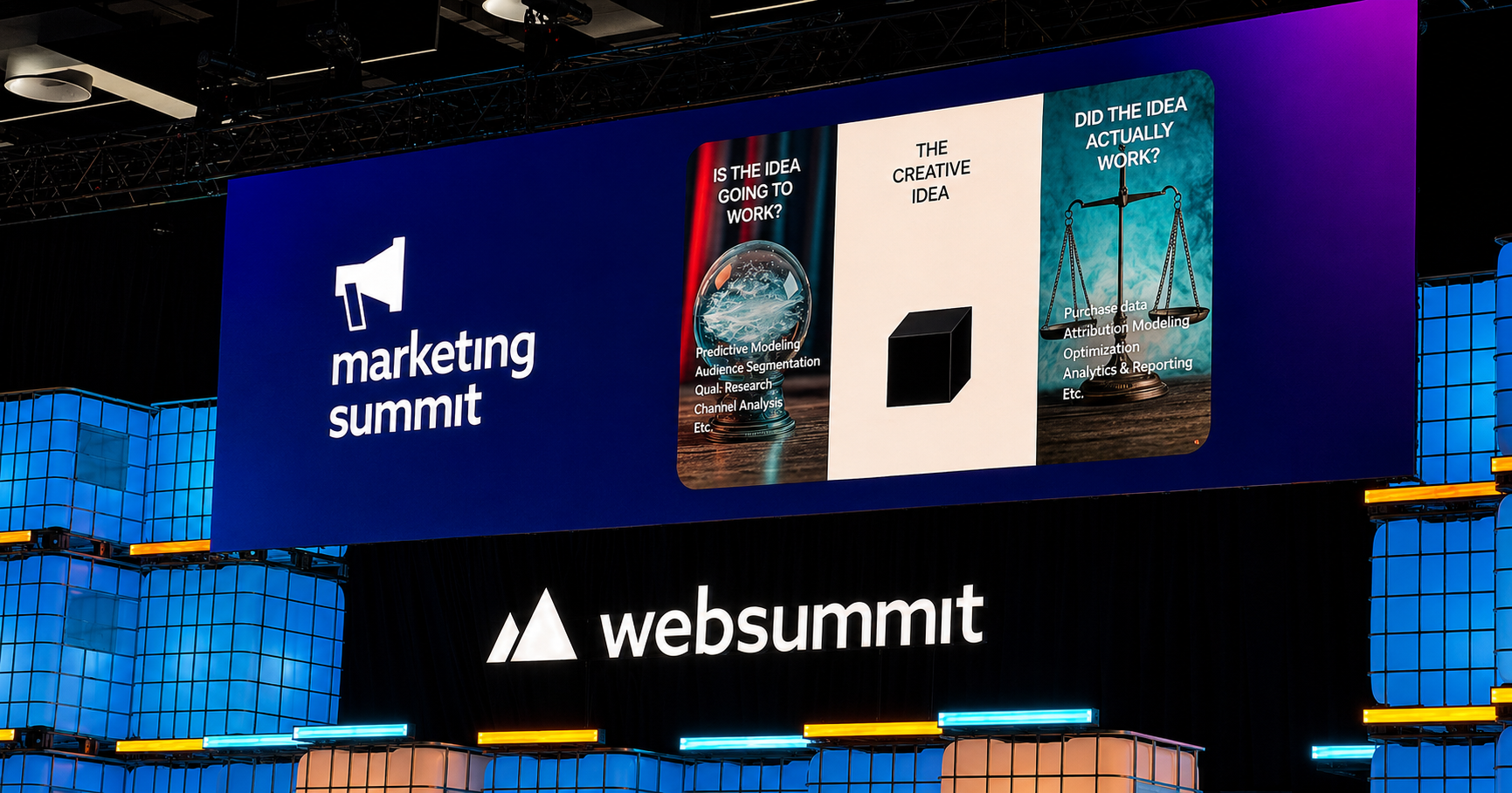
But now we can illuminate the creative side of data much more easily.
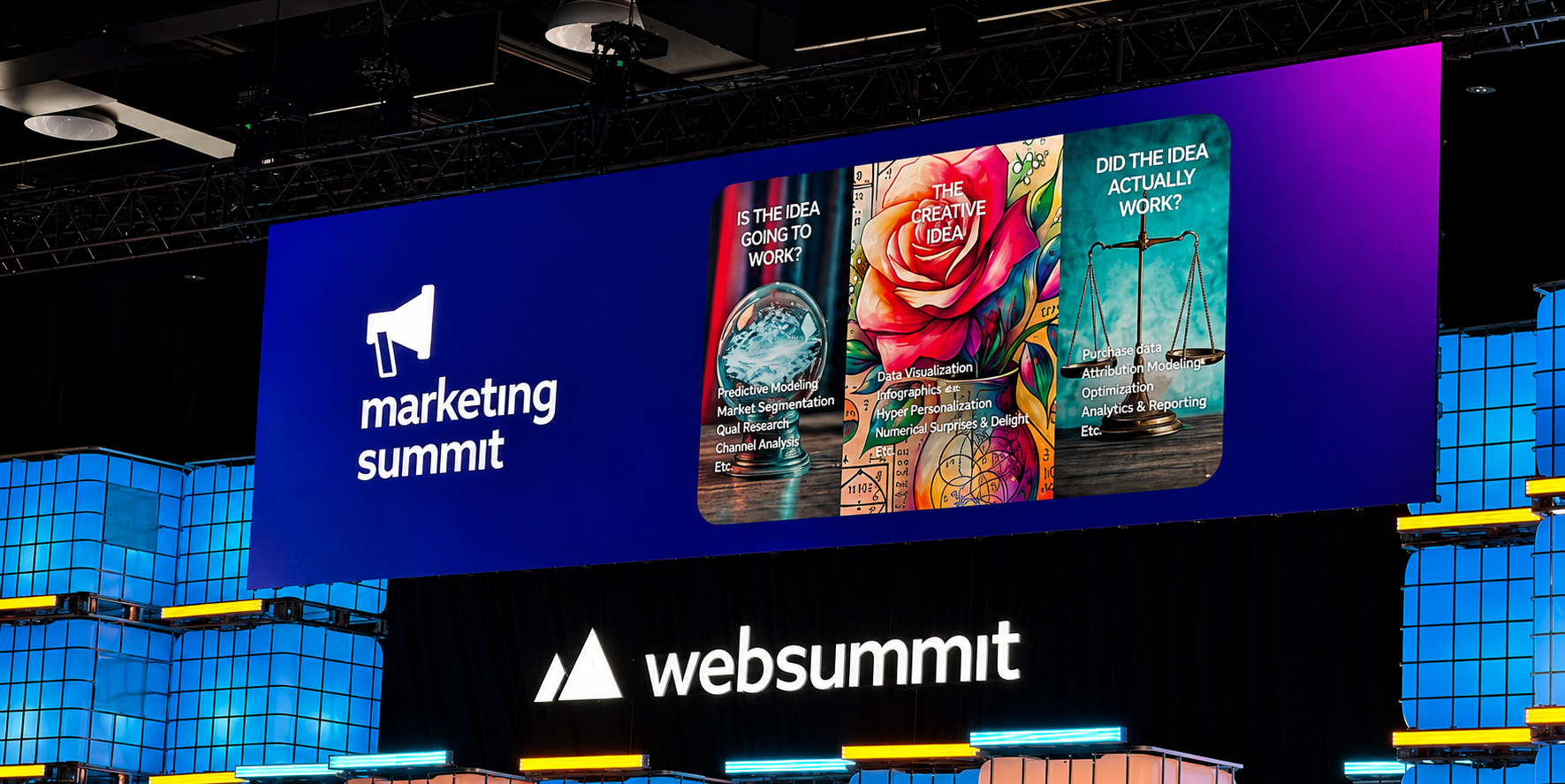
“We convinced people that data was math. If we want to inspire creative data, we need weird datasets and stories.”
Jason also shared an example he often uses: asking people what they could sell if they had data about wind.
At first glance, it sounds abstract.
But once you start thinking creatively, the possibilities expand quickly:
- insurance models
- energy forecasting
- agriculture
- sports analytics
- tourism (and many more)
The point is not really about wind.
The point is that interesting questions and unusual datasets unlock entirely different conversations.
Because in many organizations, data initiatives unintentionally become optimized for compliance, reporting, or technical correctness. These are important, but they often won’t draw someone into conversation.
Creative data changes that.
It creates an entry point. It makes people want to engage. It gives people a reason to explore.
The session reminded me of a recent conversation I had with a registrar who had just brought an institutional research team into their portfolio. One of the things we discussed was how difficult it can be to make data something people genuinely want to use, rather than something they feel obligated to reference.
Creative storytelling, unusual datasets, and human framing may be one of the most effective ways to bridge that gap.
Strong Representation from BC Institutions
I appreciated the strong representation from British Columbia's post-secondary ecosystem throughout the day.
I saw representation from:
- Simon Fraser University, my alma mater
- University of British Columbia, where I’m adjunct faculty
- British Columbia Institute of Technology, where I previously taught
- Vancouver Community College, where I’ve had several great conversations about innovation and applied learning
And many others.
It was encouraging to see institutions actively participating in and even leading conversations around AI, creativity, entrepreneurship, and technology.
Higher education sometimes gets portrayed as slow-moving or resistant to change.
That was not the energy I experienced on day 1.
AI Optimism and AI Risk
The conference opened with remarks from BC’s Premier David Eby, who spoke candidly about both the risks and promise of AI.
I appreciated the balance.
The conversation around AI often swings between extremes:
- AI will solve everything
- AI will destroy everything
The reality is obviously more complicated.
Eby referenced both the risks of AI-enabled harm — including concerns connected to incidents like the tragedy in Tumbler Ridge — while also pointing to areas where AI could meaningfully improve public systems.
The healthcare examples were particularly interesting:
- anonymizing health data for research to improve patient outcomes
- better integrating fragmented electronic health records
- avoiding billion-dollar system replacement failures by making existing information more usable
In many sectors, including health and higher education, we already have enormous amounts of data. The challenge is rarely the absence of information. The challenge is integration, accessibility, trust, and usability.
We're data integration experts. We've helped many institutions across North America create sophisticated workflows to connect disjointed systems and create comprehensive data warehouse solutions.
AI may help unlock value from systems that organizations already have, if they can organize the underlying data well enough.
Final Thoughts
Day 1 of Web Summit Vancouver felt simultaneously energizing and overwhelming.
There were thousands of conversations happening at once:
- startups trying to reinvent industries
- researchers exploring AI applications
- educators rethinking learning models
- governments trying to balance innovation and regulation
- organizations trying to figure out what actually matters versus what is hype
But one theme kept surfacing across the sessions I attended:
People like you and me are harnessing innovative ideas and new technology to improve the world around us.
Whether that’s building disposable software, making data more creative, integrating fragmented systems, or rethinking institutional processes, the challenge increasingly feels less technical and more human.
It was nice to see.