When "Very Good" Isn't Good Enough: Data Quality in Surveys
When institutions participate in national surveys, the real value isn’t just in your own numbers — it’s in how those numbers compare to national benchmarks. Are your students more engaged than average? Are your outcomes stronger than your peers’?
But these comparisons only work if the institutional file lines up exactly with the national file. And too often, it doesn’t.
Take a real example:
- Institutional file: “Very Good”
- National file: “Very good”
To a human reader, these are identical. To a reporting tool, they are completely different categories. The result? Your “Very Good” students don’t match the national “Very good” students. Charts split, comparisons fail, and the credibility of your national vs. institutional analysis takes a hit.
Why Small Data Quality Issues Matter
These problems might seem trivial, but they are magnified in institutional vs. national reporting:
- Text-based joins fail. If your “Very Good” doesn’t match the national “Very good,” the comparison column goes blank.
- Invisible characters matter. A trailing space in your institutional file might make it look like your institution has a unique answer option no one else does.
- Codes vs. labels. National surveys typically distribute both. Codes are more stable, but even they can shift between survey cycles.
- Version drift. If the institutional file and the national file are only almost the same, your comparisons are no longer apples-to-apples.
For survey benchmarking, these issues don’t just create messy reports — they actively undermine the whole purpose of participating.
Better Practices for Survey Data
A few strategies can dramatically improve reliability and accuracy when making institutional-to-national comparisons:
- Robust ETL pipelines. Automate cleaning and validation before data reaches your reporting tools. Normalize case, trim whitespace, and enforce consistent categories. (At Plaid, this is exactly the kind of automation we specialize in.)
- Join on codes — with caution. Codes are usually better than text, but they can still change across years. Build lookup tables to track shifts.
- Plan for longitudinal complexity. Surveys evolve. What was “Q3” one year might be “Q5” the next. If wording changes, comparability becomes a judgment call. This requires a data model designed to handle survey vintages over time.
- Maintain metadata. Document expected values and track changes year to year, so that when a discrepancy appears, you know if it’s a data quality issue or an intentional survey change.
How AI Can Help
AI can reduce the manual effort of ensuring comparability between institutional and national files:
- Anomaly detection. Spot when your file contains response categories not present in the national file.
- Automated reconciliation. Suggest merges (e.g., “Very Good” → “Very good”) and flag when codes shift.
- Dynamic data dictionaries. Generate updated metadata with each new survey release.
- Human-in-the-loop support. Provide recommendations while leaving judgment on substantive wording changes to analysts.
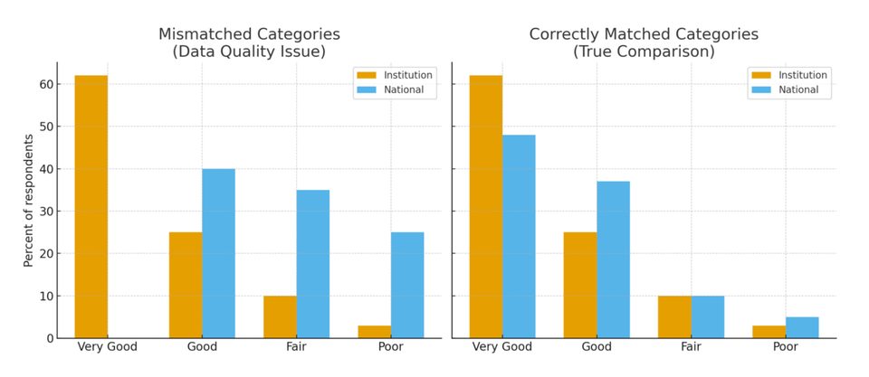
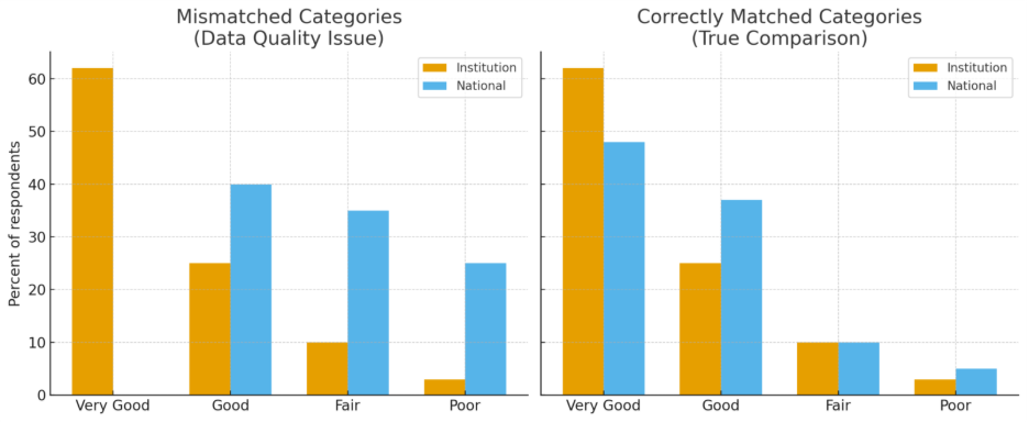
A Quick Example
Imagine an institution analyzing its national survey results. The dashboard shows 62% of students rating their skills as “Very Good.” The national benchmark, however, shows only 48% of students selecting “Very good.” Note that this only matters for two word responses: Good, Fair, and Poor would be the same in both versions.
To a human, these are clearly the same response. But the reporting system treated them as different categories. Instead of lining them up and comparing 62% to 48%, the tool created two separate bars: one for “Very Good” (institution-only) and another for “Very good” (national-only).
On the surface, it looked like the institution was far outperforming the national average. In reality, both were measuring the same thing — but because of a tiny capitalization difference, the comparison was broken.
This is why strong ETL pipelines, metadata tracking, and AI-driven quality checks matter. They ensure institutional and national categories actually match, so you don’t end up celebrating a phantom advantage or overlooking areas where your students differ from their peers.
Why It Matters
Survey participation is an investment — in staff time, in student time, and in institutional strategy. But without clean, comparable data, the payoff is lost. The difference between “Very Good” and “Very good” can be the difference between trusting your benchmark and questioning whether the numbers are even valid.
Robust ETL processes, careful handling of longitudinal survey changes, and AI-powered quality checks together make survey data a reliable foundation for comparing your institution to the national picture.
Because ultimately, the value isn’t just in your own data. It’s in what you learn when you can trust the comparison.
Plaid turns survey headaches into survey wins.